Ancillary Advert
Posted in Uncategorized on March 17, 2011 by eddytessEvaluation
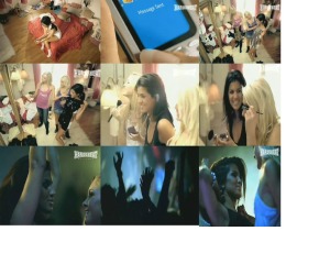
Posted in Uncategorized on March 11, 2011 by eddytess1. I chose to create a 3 by 3 ‘art of the title’ style grid of screen shots from our film to describe how it compares to real media products. I chose different scenes of our Music video to represent the similarities between it and real Music videos in the Media industry. When we were making our Music video we used many of our ideas from watching Basshunter’s Music video Now your gone amongst others. I chose to use the first photograph which is shown at the start of our film and it is normally shown in most media products at the beginning as it tells the audience what they are viewing and who wrote the song and what it’s called. The second and third still I took is of Anna and her mobile phone as this was also shown in Basshunter’s Music video. I then chose to use a still of Anna as she is drinking champagne which creates a party scene as she is getting ready to go out and also because it shows her as the central protagonist of the Music video which is important. I then chose two photographs which were used as stills in our Music video as it shows girls having fun and it adds fun to the Music video as I based it on girl’s having a night out together. I then chose another still of Anna as she is the central protagonist, the film should again focus on her as she is the main person used in our film. I then chose both the photo of Anna and Susann getting ready together because this was used in Basshunter’s video and it shows them together having fun and having a girly time together before they go out. I also used the word Infinity I used it to be on the beat of the Music video to create a house music effect to our film:
3. I asked two girls in my year what they thought about our Music Video once they had watched it and then I video’d their comments:
4. The web link to my wix site:
www.wix.com/remt3163/Media-evaluation-A2-coursework
By Tess Remp
Editing
Posted in Uncategorized on March 4, 2011 by eddytessWe have been finishing the editing on our music video throughout the week. We are nearly finished with the film and ready to post it onto our blog. We realised that we in fact did not have enough footage that could be used so we decided to change our video and add in the words ‘INFINITY’ to go in time with the music and we also added a lot of photographs taken in various socials throughout the year to add to the party scene. We have not yet finished our film but are thinking of more ideas to make our music video better.
By Tess Remp and Eddy Bunte
Our digipak
Posted in Uncategorized on February 16, 2011 by eddytessThroughout the week we researched different DigiPaks for ideas for our own. We decided on the photographs we wanted to be in our DigiPak and edited them with Photoshop:
By Eddy Buente
DigiPaks and CD Cases
Posted in Uncategorized on February 4, 2011 by eddytessWe researched the difference between CD Cases and DigiPaks. In a CD Case there is the front cover which is a booklet of the music and lyrics. There is then the CD and the back cover telling you the songs which are found on the CD. Whereas a DigiPak is a card open out book. So on the front cover it has the name of the song and sometime a photograph and inside there are two or more photographs with another one on the back with the songs written on. Although in some DigiPaks the artist chooses not to have the songs on the DigiPak.
We researched different CD covers to help us decide on ideas for our own:
We like the Club Land cover as it represents the music really well as it is very club like and disco like. We also looked at the cover of a DigiPak for Guru Josh Project’s Infinity 2008 CD cover:
We liked it because it liked to the music video for the song as the instrument is used in the Music Video aswell so it has given us lots of ideas.
By Tess Remp
Fonts for our DigiPak
Posted in Uncategorized on February 3, 2011 by eddytessCD Cases
Posted in Uncategorized on February 2, 2011 by eddytessWe researched many different artists and their CD Cases to see the difference between the different genres of music and the artists.
We looked at Britney Spears because she is very famous and she has had a lot of different albums out since she was a teenager so we looked up one of her first albums made, ‘Baby one more time’:
In both of these front covers of Britney, she is on her own, and she represents the music in a way as she is portrayed thr0ugh the photograph as being child like and innocent which at the time represented her music which was targeted at young girls. Whereas now she has changed her music to more sexy, upbeat and new music which is also represented through the way she promotes the music to her audience:
The Pussycat Dolls front cover for their album Domination is similar as it is sexy and it shows them in on motorbikes which represents them as being dominating:
I also looked at The Saturdays whom represent music for younger girls than the Pussycat Dolls as they have more tame music:
As I researched each of these artists, I discovered that each artist has their own font which helps to represent their music as well as their photographs. For example, Britney’s font in her first album ‘Baby one more time’ it is squiggly and girly whereas Basshunter’s font represents his music as being house music and party music as it is bold and different and he uses this on every album as they are all similar as his music stays the same:
Also in every cover, it has the people or artists who are in the music videos for the music albums.
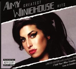
Also on Amy Winehouse’s cover for her greatest hits it has a sign on the front which reads ‘Parental Advisory, Explicit content’. This is an important aspect to review whilst making a CD cover as if the music has explicit language in it, parents may choose not to allow their children to listen to it, and so to do this they need to know that it contains explicit language before playing it:
By Tess Remp


![britney-spears--baby-one-more-time[1]](https://eddytess.files.wordpress.com/2011/02/britney-spears-baby-one-more-time1.jpg?w=300&h=300)
![britney-spears-baby-one-more-time-cover-011208-thumb-450x450[1]](https://eddytess.files.wordpress.com/2011/02/britney-spears-baby-one-more-time-cover-011208-thumb-450x4501.jpg?w=300&h=300)


![pussycat-dolls-domination-album-cover[1]](https://eddytess.files.wordpress.com/2011/02/pussycat-dolls-domination-album-cover1.jpg?w=300&h=300)
![the_saturdays_album_cover[1]](https://eddytess.files.wordpress.com/2011/02/the_saturdays_album_cover1.jpg?w=300&h=300)


